I’ll be the first to admit that I’m not an authority figure when it comes to design. I will also admit that I’ve been doing this long enough to know bad design when I see it and unfortunately I see it a lot as make way around the Metro-Detroit area. What is the leading culprit? The Old English “D.” You see, our beloved Detroit Tigers adopted the “D” as part of their branding many moons ago and it’s done quite well for them. That, coupled with the fact that Detroit is chock full of die hard sports fans leads us to a time and place where seemingly every small business owner in the state of Michigan wants to incorporate the Old English “D” into their logo, branding, or website.
- Don't believe me? Take a look at a few of these logos.
-
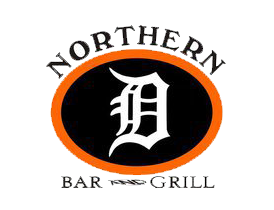
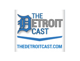

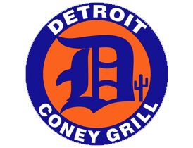
I know for certain at least some of them do very well for themselves and a lot of good for the city. With all of the long hours put in I feel as if they deserve to have better branding. I, in no way, mean to disrespect or pick on any one of these companies. These logos were all found after a short Google search or from me as I snapped a photo of yet another example. They all incorporate the “D” in one way, shape, or form. Although the ties to Detroit are a great thing, this hurts their brand for many reasons.
Not only does the Old English “D” look tacky and out of place in almost every situation, but it does nothing to distinguish their brand from the next guy or girl down the road. This sets these small businesses apart from no one, leaving them in the melting pot of other small businesses. Use of the “D” screams amateur design. Whether or not these small businesses design their logos themselves or hire a large firm to do it for them doesn’t matter. If they insist in using the “D” in their logo or branding, it is going to scream amateur. Do yourselves a favor and avoid this mistake.
Focus on your brand, your audience and your taste.
If a new yoga studio opens in Midtown, Detroit, then chances are that their target market isn’t going to the same as somebody who is just starting a bar and grille on the east side of the city.
If they consider their target market as they work to create their brand their branding will be a success. That yoga studio could prove that they bleed Detroit through and through by using the Old English “D” but in my opinion they’re already proving that by putting their money where their mouth is and opening up a studio in Midtown. The “D” just sets them up for branding that doesn’t fit their model.
The imaginary yoga studio should focus on their audience to come up with the perfect brand for their company. Their audience is full of young professionals who most likely live and work in Detroit. They are already Detroiters. They already live and breathe the city. They’re doing anything they can to support local businesses. Using an Old English “D” is not going to do anything extra to help their brand.
Instead, the yoga studio owner should do research online and around the city in order to understand the look and feel that most successful studios exude and try to emulate that vibe starting with a pen and paper. It won’t be long before the studio’s got some great ideas flowing and some potential brand items created. From there it’s just a matter of refining and hiring a graphic designer to complete the job.
This piece is in no way meant to be insulting to any Detroit small business owners who use, have used, or are thinking of using the Old English “D” in their brand. I’m sure it can work from time to time. It did for the Detroit Tigers, after all. However, it might be worth exploring other ideas and designs in order to differentiate yourself from the next guy.