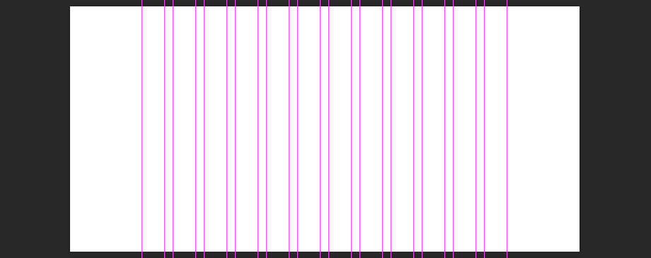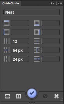
Since Bourbon Neat is based on the Golden Ratio and em units, I find that this post is the easiest way to set up a Photoshop document to be comparable to Bourbon Neat’s grid system.
Ever since I discovered Bourbon, I’ve been in love with it. A huge list of functions that don’t compile into CSS unless I actually use them? It’s the perfect set up. That’s why I refuse to use anything but Bourbon’s grid system, Neat. It’s a CSS-based system which means my markup will be left free of div-itus. Neat’s grid is meant to be responsive which means it isn’t exactly easy to use with a static grid generator like GuideGuide.me.
Guide Guide
Guide Guide takes a series of parameters like top-margin, right-margin, bottom-margin, and left-margin as well as Number of Columns, Column Width, and Gutter Width. They also create grids for rows but for the sake of this post, we’ll ignore those settings. Guide Guide automatically aligns the grid to the left-most area of the document which might be handy for some uses but I’d prefer a grid system to align to the center since that’s what a grid system will do in CSS.
“Just set the left and right margin if you want it aligned to the center”, you might say. While that’s possible, I am lazy and don’t see a use for doing the extra math required to perfectly center the grid.
Figuring out Neat’s Specs
Since Neat is based on em units and the Golden Ratio, I decided to go about this the easiest way possible. Blatant stealing. If you have a look at the Bourbon Neat examples page, you’ll see that they have the visual grid turned on (this is another great feature of Neat). I took a screen shoot and measured the width of the column and grid in order to get my base measurements.
The Measurements

When I took a screen shot and measured it inside of Photoshop, the specs come out to the following:
Grid Width: 1032px
Number of columns: 12
Column Width: 64px
Column Gutter: 24px
The easiest route I came up with is to create a new document 1032px wide by any amount tall. When complete, press the “C” key to activate the crop tool. Hold Option / Alt and drag the crop tool to as wide as you’d like. Voila! You now have a perfectly centered grid that is compatible with Bourbon’s Neat.
All in all, this route works pretty well for me. I’m not sure if having a grid set up to specifically replicate the CSS used even matters, but when it comes to design, I need all of the help I can get so if my grid system inside of Photoshop matches with the grid system I use in CSS, then I’m one step closer to being able to create what I design.